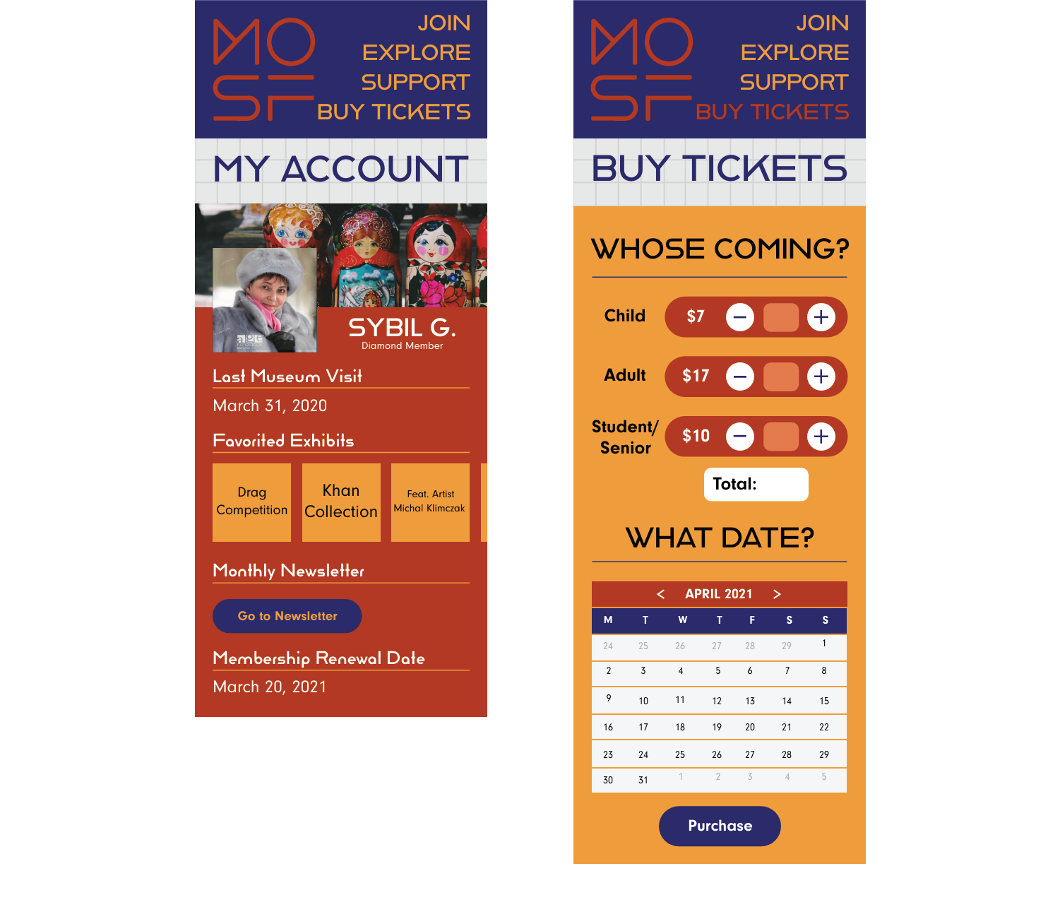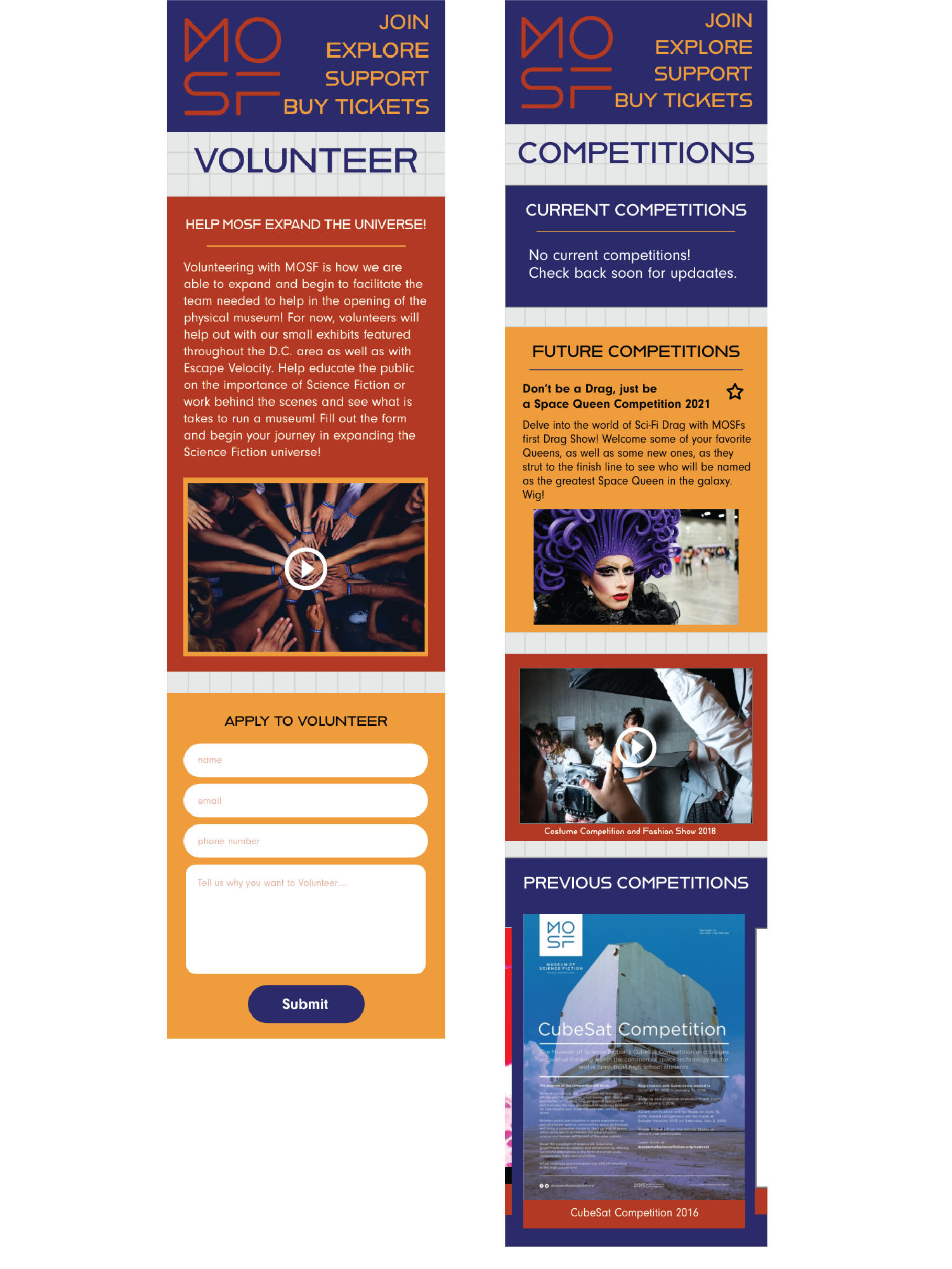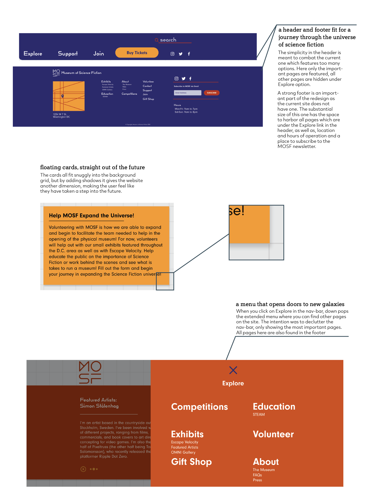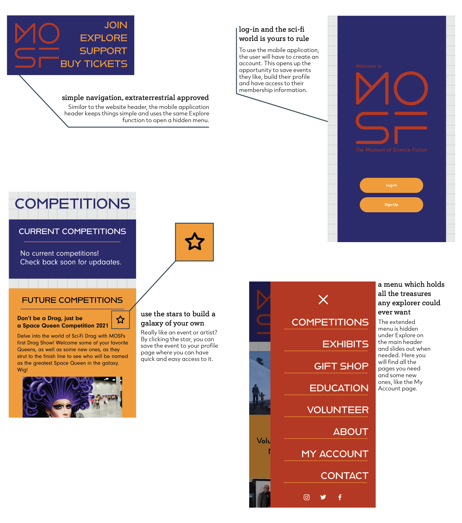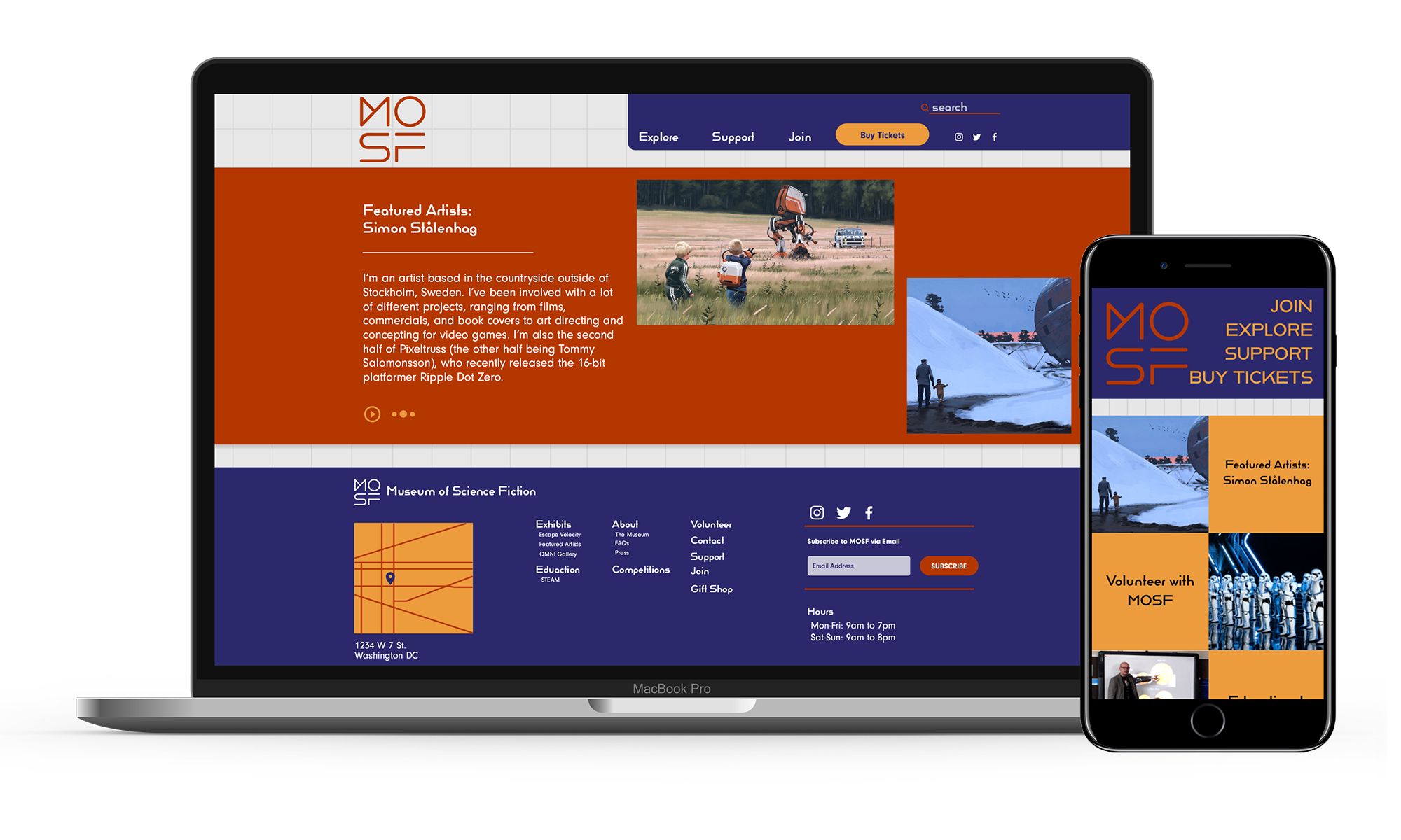

In my interactive course during the spring 2020 semester, my professor asked our class to each redesign the website and mobile application for The Museum of Science Fiction. The museum is not yet an actual place to visit, but rather an idea with really great potential, but the state of the current website holds them back. As a class, we created project and company goals for the museum and were each asked to prototype what we envision for the Museum of Science Fiction website to look. During the semester we created user personas, mood boards, refreshed site maps, as well as, low and high fidelity wireframes, ending with our final prototypes for both web and mobile.
Designer || Research, Design, UI/UX and Prototyping
4 months
High-fidelity Prototype, Final Report
Adobe XD
Your device is too small to show this prototype. Trying turing your device to landscape or switching to a larger device.
As a website for a museum about science fiction, the current site struggles with creating a 'out of this world' experience. The site has many links which lead to pages on other sites instead of staying local and there is minimal organization of the site. Not only is it hard to navigate, the design has a generic feel to it and is missing key features like a substantial footer and interactive homepage and the excess amount of information under each tab in the navigation bar could be simplified to make the site easier for the user to navigate.
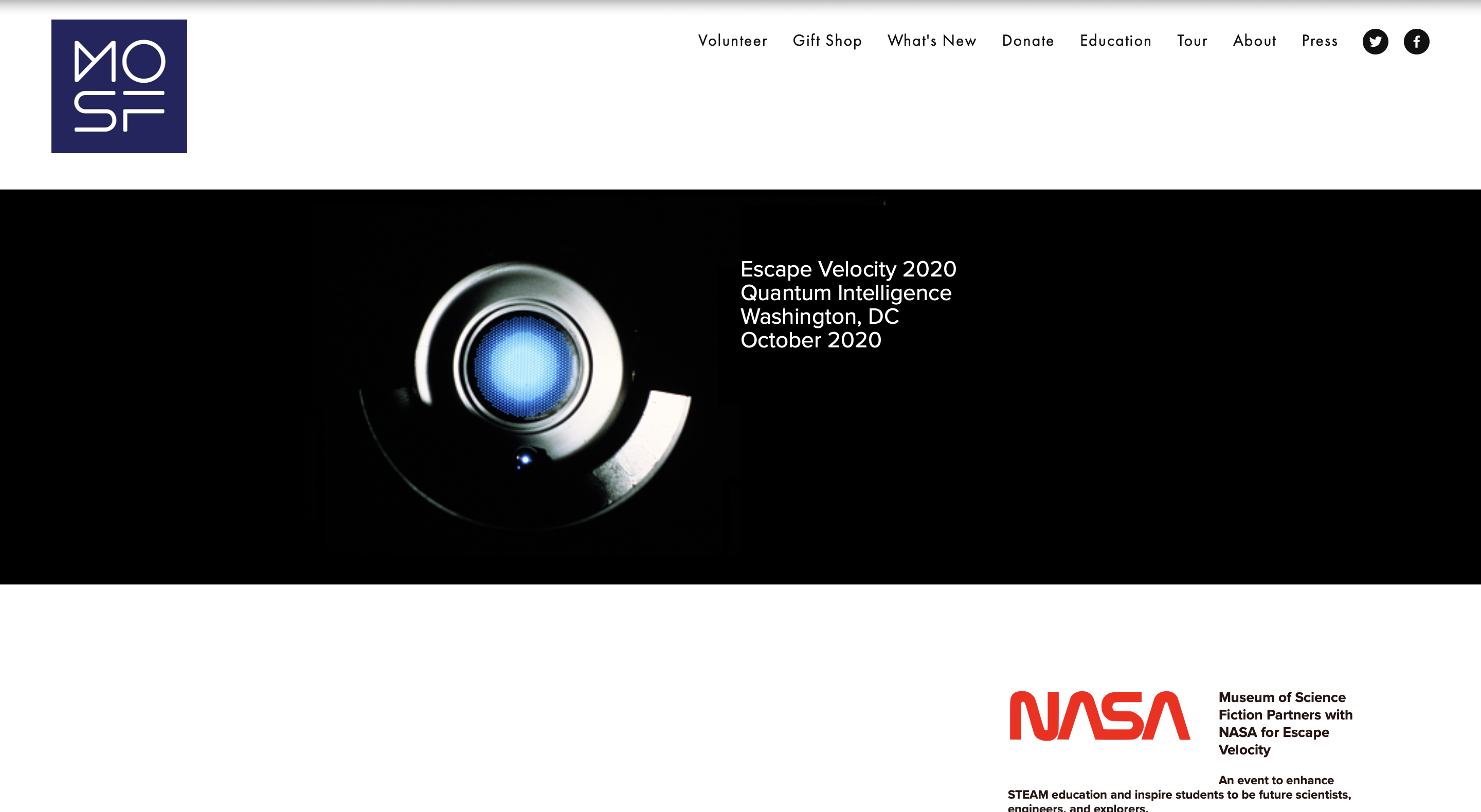
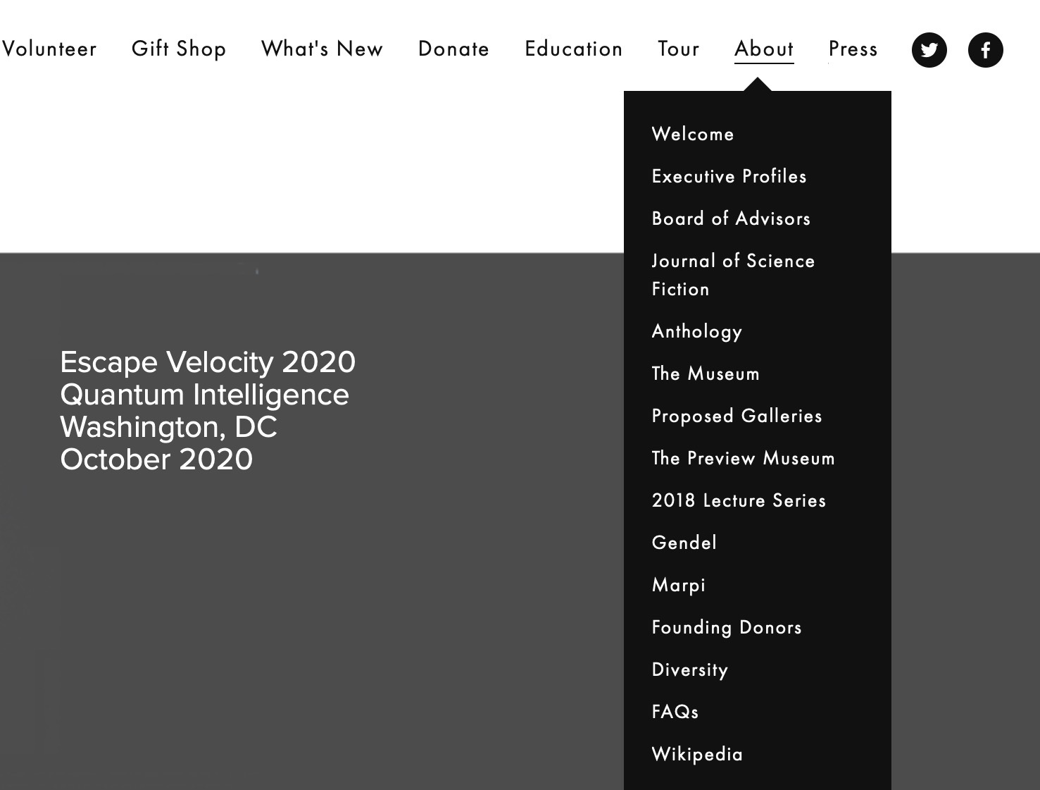
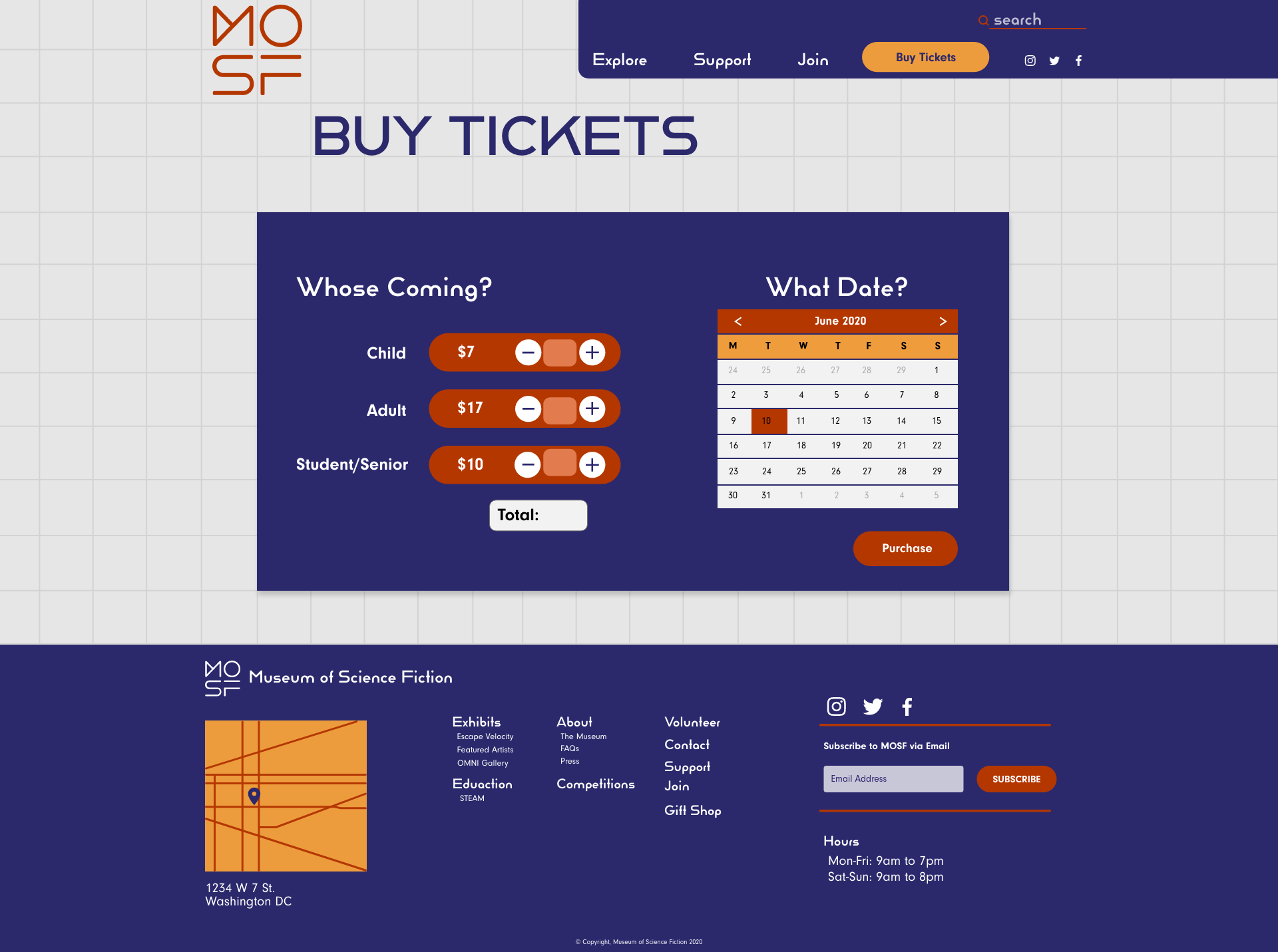
These observations about the current website lead to why it is important when redesigning to consider creating a more engaging site which keeps the user interested in the museum and even visiting once it opens. The redesign is made with the idea that the museum is a physical space to visit, including pages such as Buy Tickets and Join, a membership subscription to the museum.
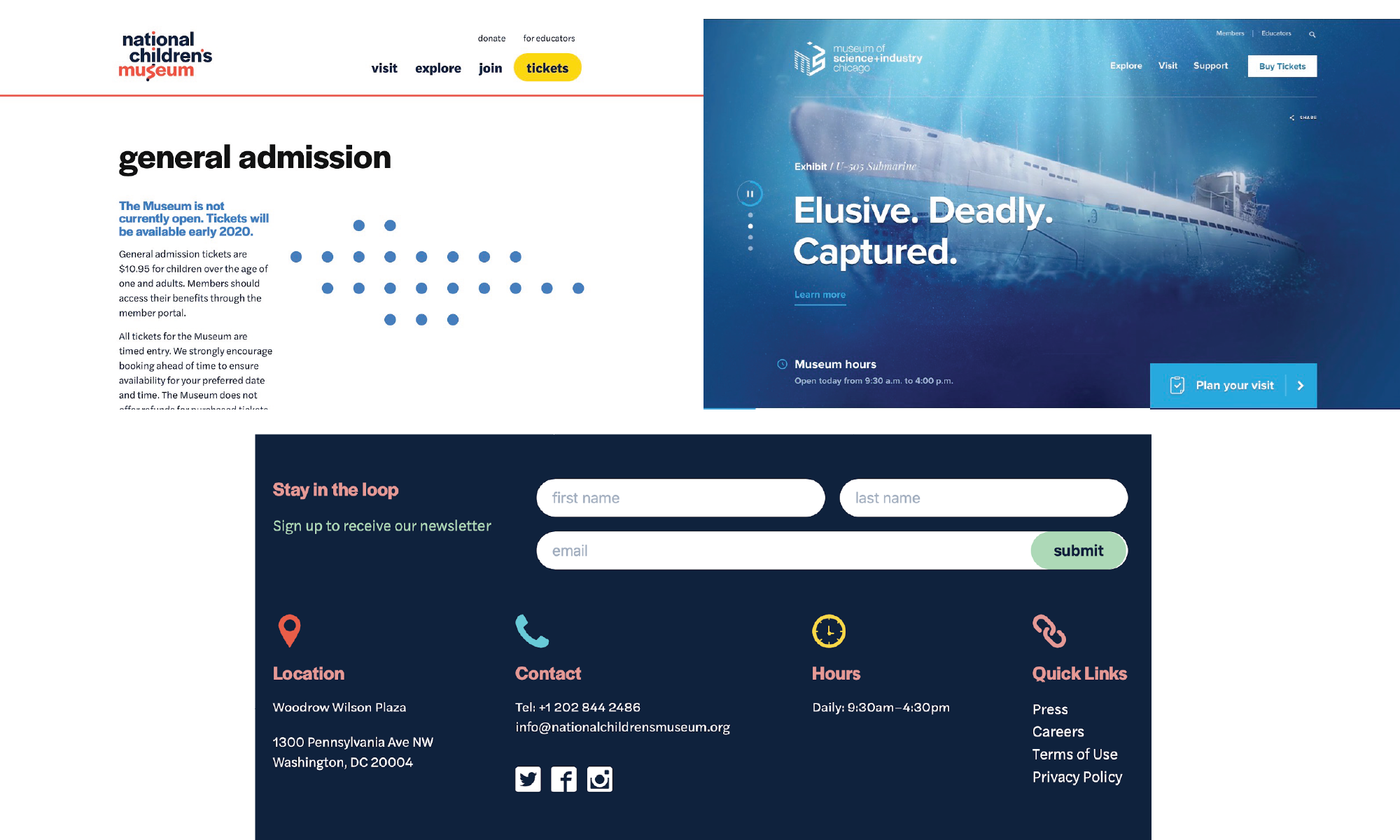
For the redesign, I researched other museum's websites to see the color schemes, site organization and user engagement. I looked at The Museum of Science and Industry in Chicago, The Smithsonian in Washington D.C., and The National Children's Museum, which like MOSF is still not a physical space but just a website. These provided great inspiration for page structure, button placement, header and footer sizes and how a real museums expect users to interact with their sites.
In our class, we were all assigned to small groups and assigned a specific user persona. Together, the group came up with the details about the user but we all individually created user persona pages that fit our respective website ideas. My group got the user persona of Sybil, an older Russian woman obsessed with the more literature heavy side of Science Fiction.
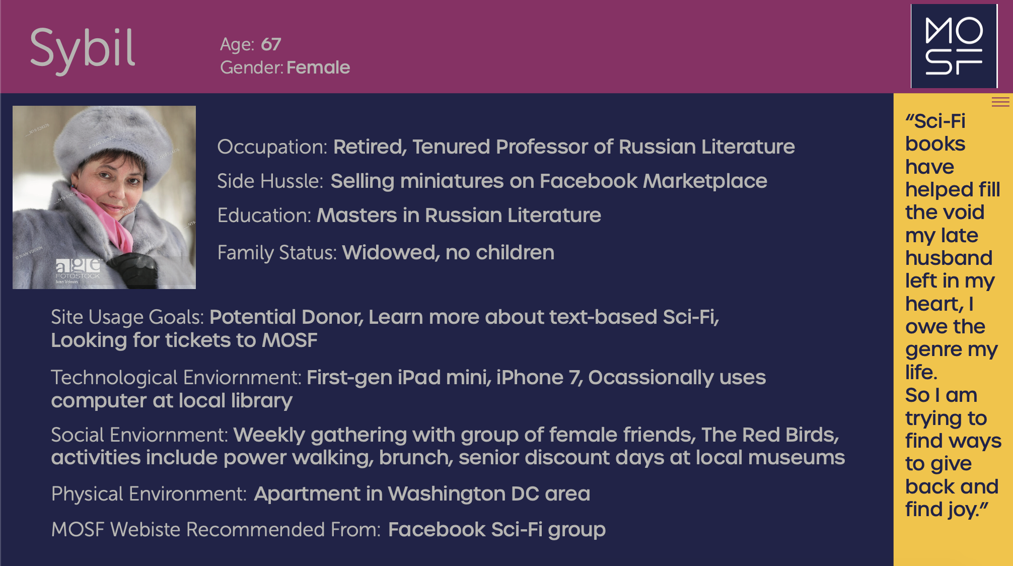
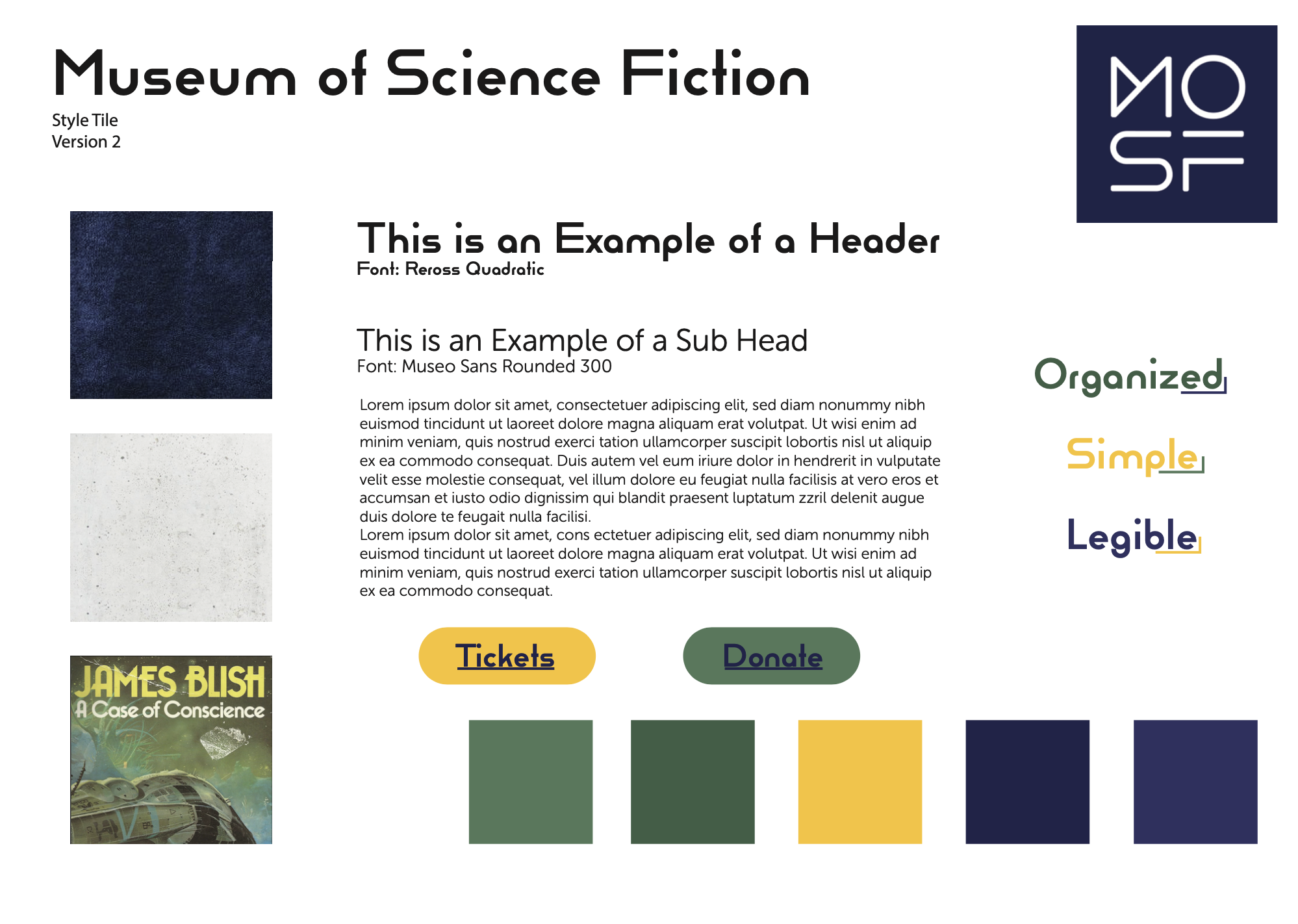
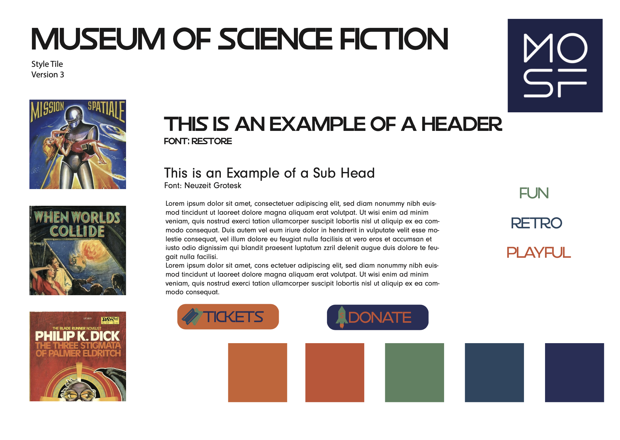
From my user persona, I decided that I would want to use the color schemes from older science fiction books for the website and was able to create these two style tiles, with which I ended up using inspiration from both. I also tried to find typefaces which were easily legible and reminded of the fonts used on the old sci-fi books.
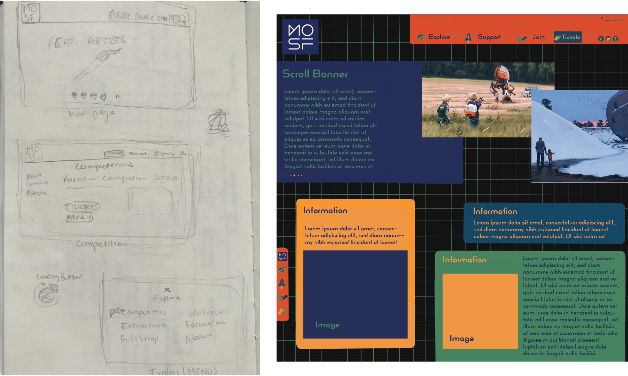
I made some quick initial sketches in my sketchbook but then took the time to illustrate a more in-depth version of a homepage.
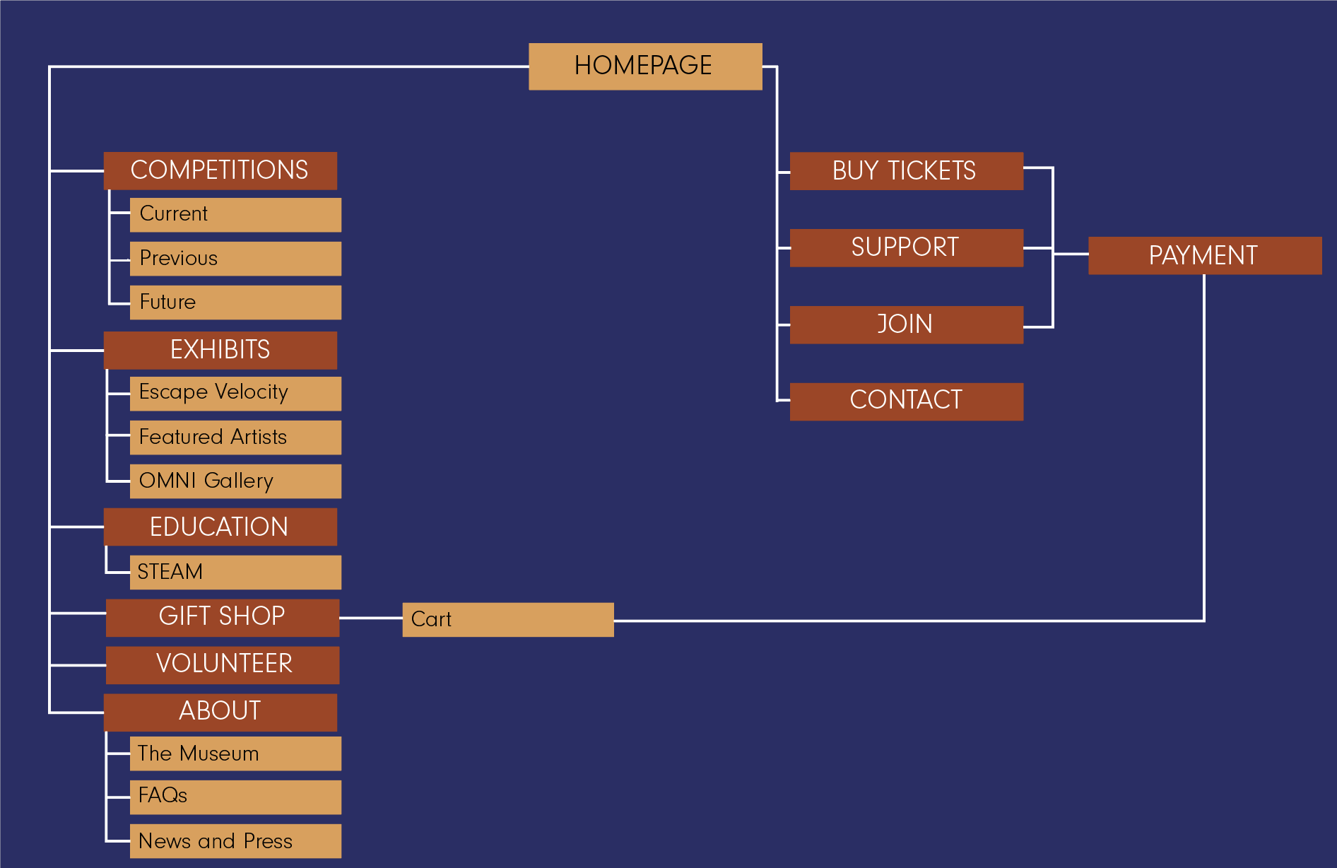
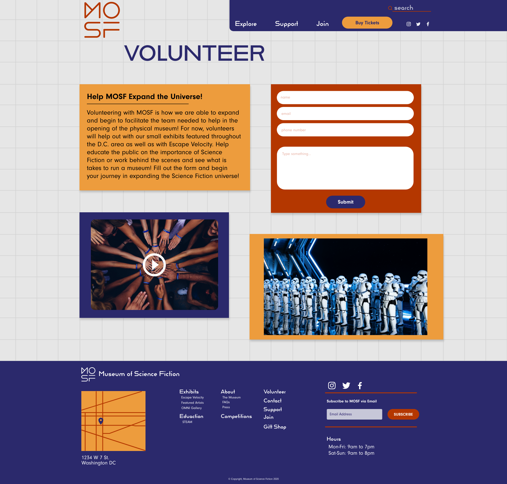
When thinking about the site map, I made sure that the amount of pages which would be in the final prototype would be significantly less than the current site has. When downsizing, I also kept in mind the importance of including pages such as Volunteer and Gift Shop on the actual MOSF site and not just links to off-site pages.
