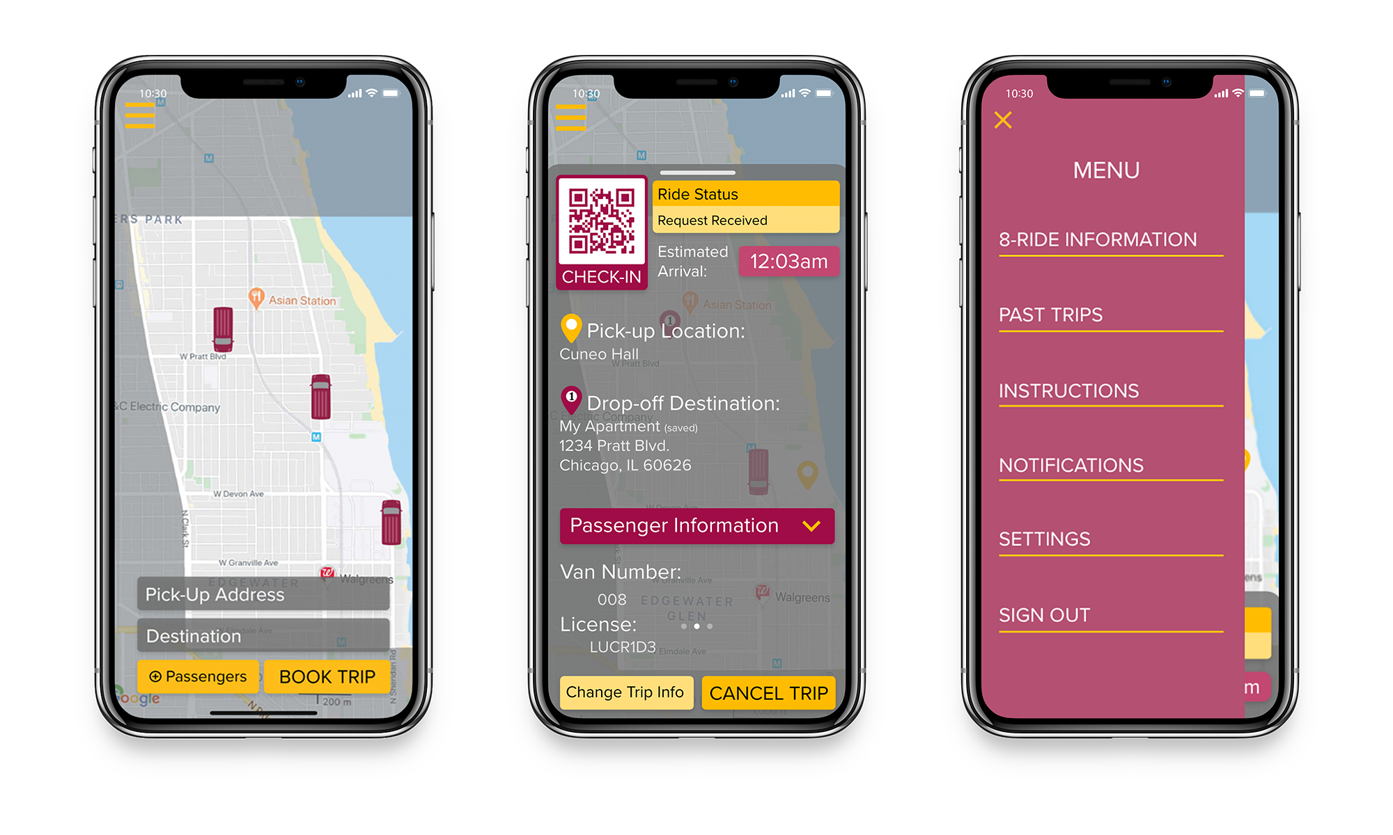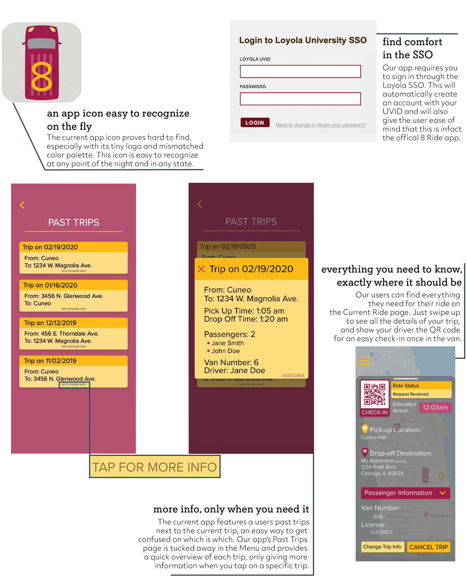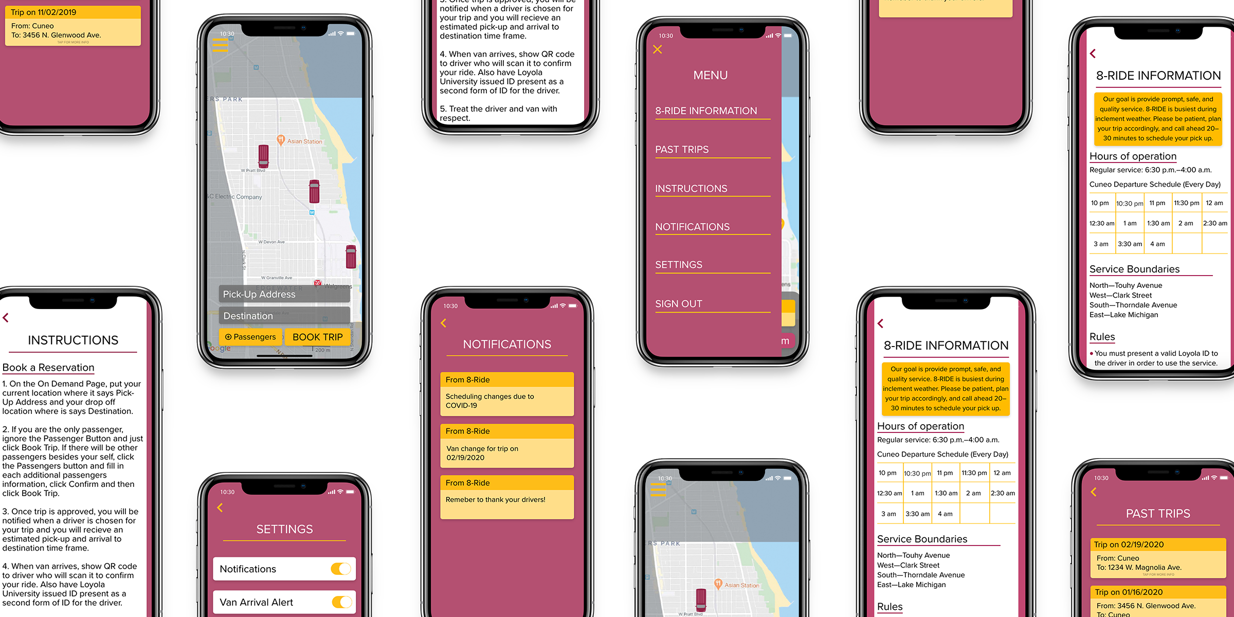

8 Ride is a free ride service for Loyola students which will pick up and drop off a student from any location within a 2 mile radius of campus, including campus itself. This is a very convenient service and is utilized by many students, including myself. The one fault in this awesome program is the current app used to book an 8 Ride, which features many design and usability issues. Our group chose the redesign of this application as its immense flaws left lots of room for improvement and gave us an opportunity to enact positive change in our community. Our final product brings a modern way of booking and interacting with 8 Ride, creating convenience for both the driver and passenger.
3 members
Designer || Research, UI/UX and Prototyping on Menu page and associated pages
4 months
High-fidelity Prototype, Final Report
Adobe XD
Our research began with understanding the current applications layout and why it was nonfunctional. We found many students complain that the app has a confusing organization which makes it difficult to find your current trip. The app also does not open onto the book trip page, but requires the user to click through multiple screens to get there. Those first pages do not add anything to the design, only create complications in reaching the end goal. The only page which still displays some function is the On Demand page which has two simple text fields where the user enters their location and destination to book a trip. We found that once the trip is booked, the On Demand page reloads and shows empty fields. The app assumes the user will understand that they must go to the My Trips page and click the blue text where it says On Demand as the place to find the trip the user just booked. This process is time consuming and the user can easily get lost or reorder an 8 Ride which then becomes a wasteful for the company as it will send more than one to the same location.
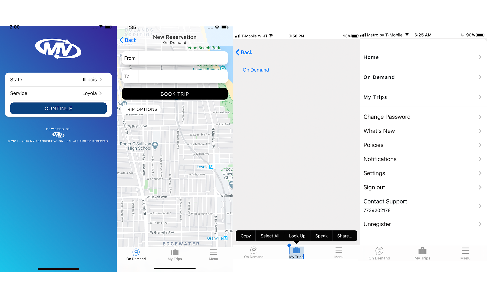
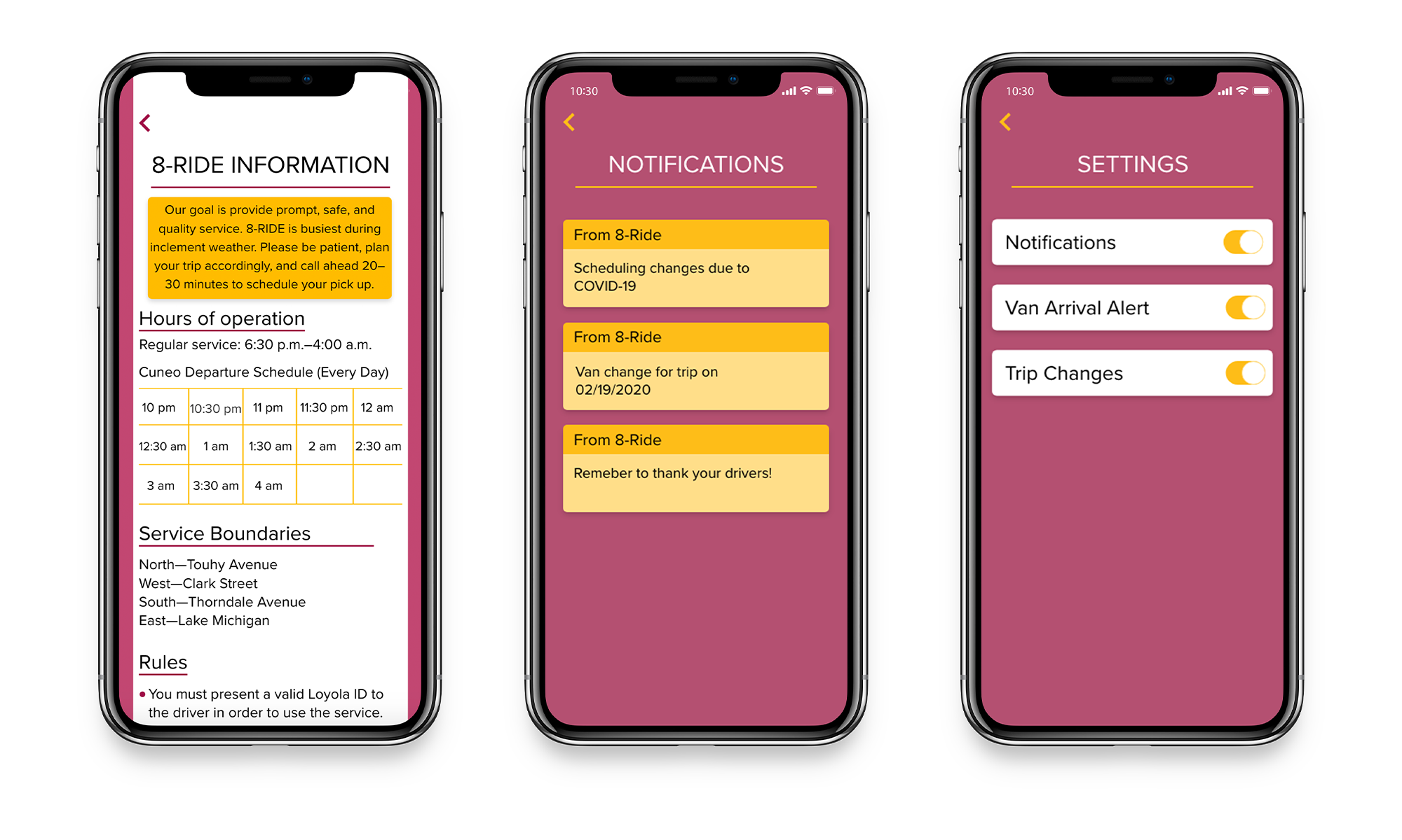
The Menu page features a lot of links which would be deemed useful, but all of them lead to empty pages. The Menu page also features links to the On Demand and My Trips pages which is repetitive to the navigation bar at the bottom of the screen. We also noticed that the Sign Out button does not have a warning pop up asking if you would like to sign out, but rather just proceeds with the action. One of our group members learned this the hard way, and then was unable to sign in again. Our research showed us that the current app needs to be redesigned as some of these design flaws could be harmful in the long run. The service is meant to be a safe and free way for students to navigate the Loyola neighborhood at night, and with frustration from poor usability a user may forfeit the use of the 8 Ride and rather walk or find another way to their destination.
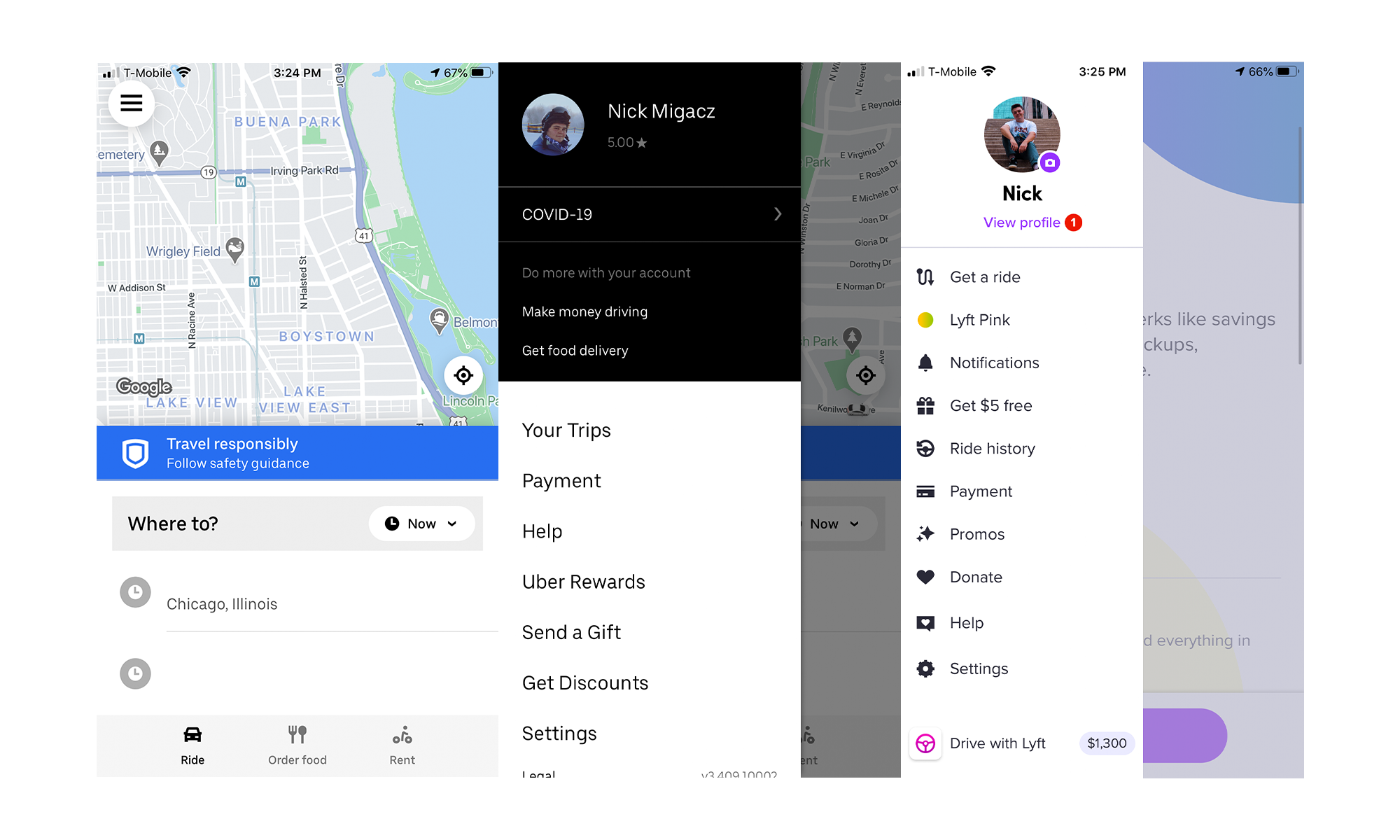
Our group looked at some other ride share apps for inspiration on where we could take our redesign. We specifically were drawn to the two big ones, Uber and Lyft. The images below feature both of the apps menu designs as that was my main role on redesign and I really liked how both of these apps utilized a slide out menu which is the direction in which I decided to take the menu as this way you would never be too far away from the most important part of the app, the actually ride booking and trip info page. We also really drew from the ride booking page and decided we would move the location and destination fields to the bottom of the screen.
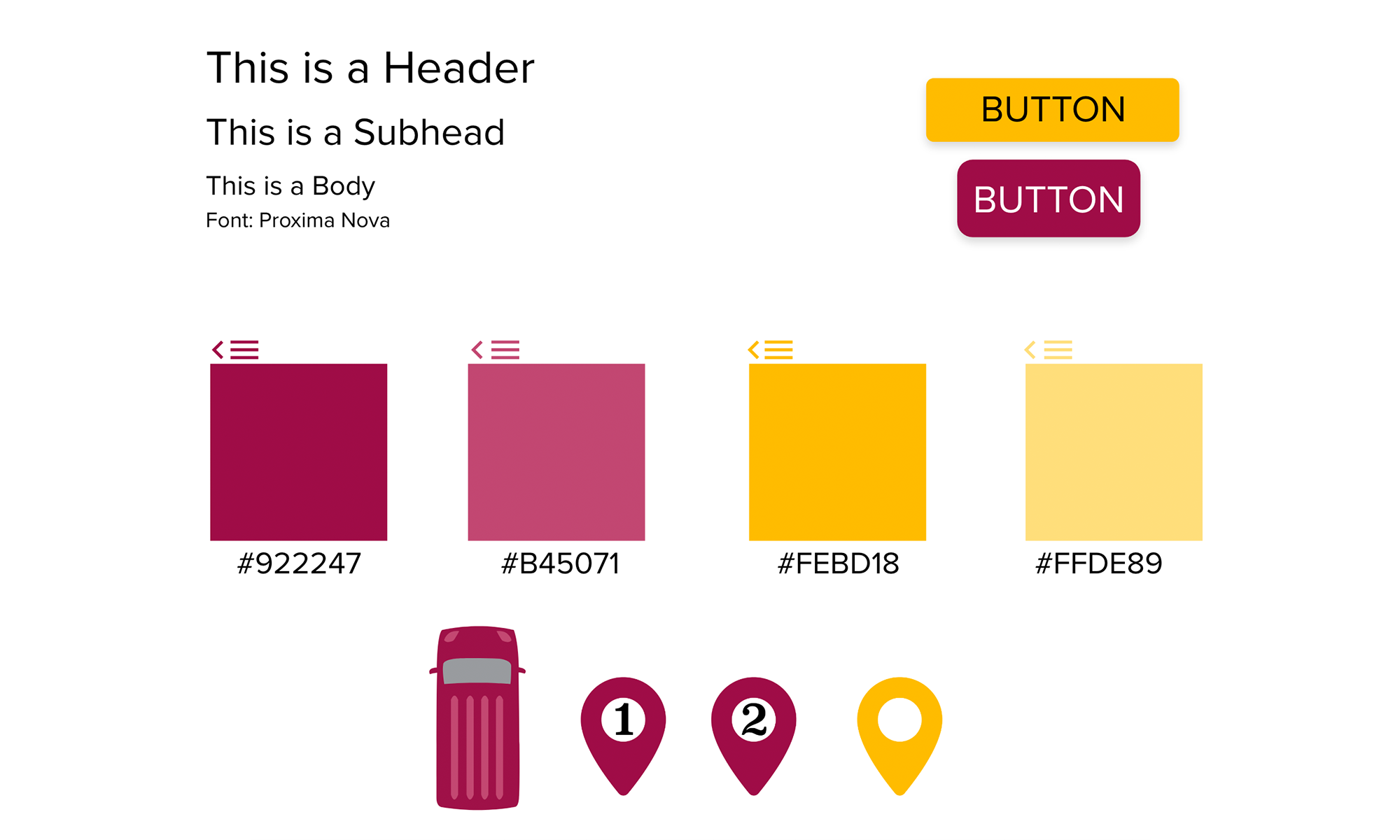
We originally were planning to use non-Loyola colors, leaning towards a purple or blue color to be as colorblind accessible as possible. However, the more work we put into the colors the more we felt we lost the Loyola affiliation we were trying to achieve, so we returned to Loyola colors and added a muted version of each color as secondary colors. The colors are still fairly colorblind accessible but not to the complete extent we had originally hoped. For our font, we chose Proxima Nova and decided that we could use uppercase for certain parts of the app to help with needed differentiation. Although this is not one of Loyola's official typefaces, we felt that this subtle difference would not raise too many questions.
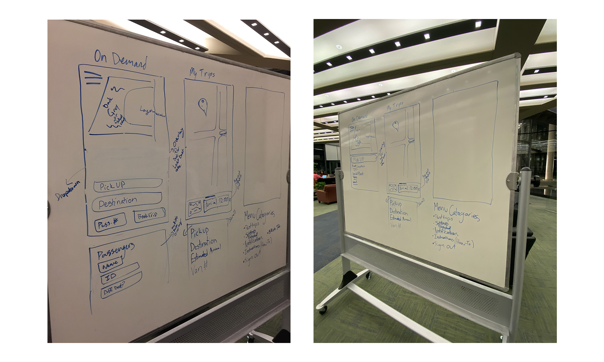
We worked together through some initial sketches trying to figure out how to best rebuild the application from the ground up, avoiding the issues the current app runs into.
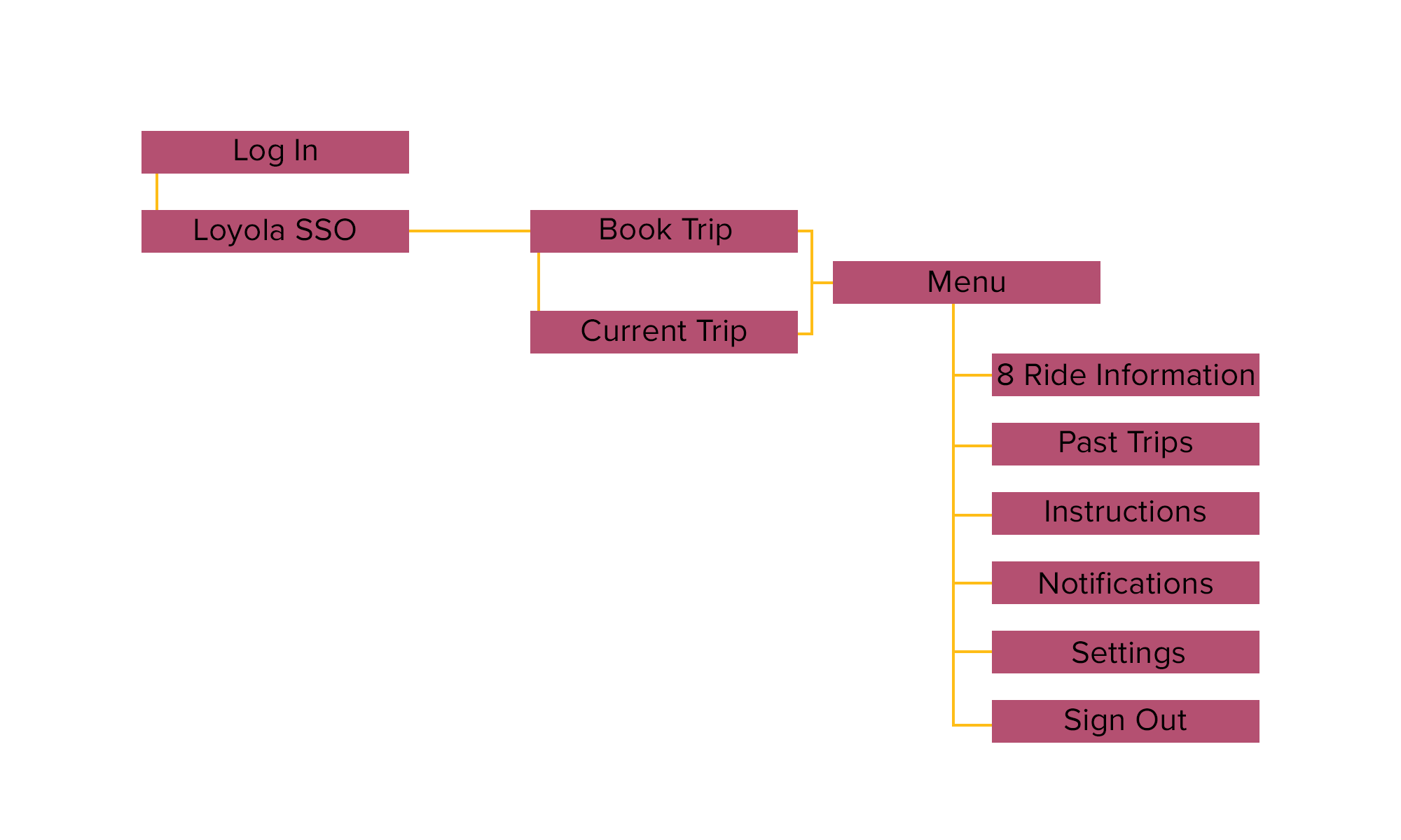
Something our group agreed was good about the current app is that there is only three pages to navigate between. We decided to keep the same structure for our app and only add useful pages off of the Menu bar. The site map represents the simplicity and organization we were wanted to achieve.
